Friday, May 14, 2010

Summary

What I liked about Digital Fine Art Photography?
  • the assessment of favourite famous photographers because it made me look at the different styles of photography and acknowledge what type of photographer I might want to become

  • that the portfolio was open and we could make our own decision on what and how to present it

What I disliked about Digital Fine Art Photography?
  • As I totally repel technology (computers and the Internet) I struggled with the online assessments. (I would have liked it if we got to chose either blogspot or flickr or if just blogspot was used)

What I learnt in Digital Fine Art Photography?
  • how to use Adobe Photoshop (although I'm still trying to get the hang of it)
  • different styles of photography
  • different cameras; lens and abilities
  • aperture and shutter and how to alter the speed to create different images
  • how to re size images for Internet use
  • different historical photographers

Thursday, May 13, 2010

Week 4 - Seeing Triple

Our task for week four was to take three images of ourselves and layer them into one another. This was done using Adobe Photoshop and although it was a bit difficult to use this program at the start it was fun and engaging.

Portfolio Idea Four

These images represent another idea that I have considered for my portfolio. They include photos taken at Eden and at the Dandenong Ranges.


Famous Photographers

Our assignment was to chose our favourite photographer and share his/her works with the rest of the class. The photographer I had chosen was Alvin Langdon Coburn, but here are some of the other photographers that were mentioned.

Cartier Bresson- was a French photographer who was considered to be the founder of modern photojournalism. He used a Leica 35mm camera and mainly took candid images, like the one you see to the left (http://www.lacasapark.com/la/wp-content/uploads/2010/04/cartier-bresson-hyeres1.jpg).

Bresson had wrapped his camera up in black tape to make it inconspicuous and preferred not to use the flash as he saw this as impolite.

He photographed in black and white.

Kyle Humphrey- is a 20 year old photographer from North Carolina coast. His works include portraits, landscapes and images of clay people. Although he is a fairly young photographer and has only been taking images for a couple of years Humphrey has won multiple awards for his works (such as the North Carolina Aquariums 2010 for his image 'striped bass' featured below

and the North Carolina Coastal Federation photography contest). Humphrey's style of photography is very modern, he is potentially a photographer to remember in the future .

(http://kylehumphrey.com/ : both images)


Anne Geddes- is an Australian born photographer who has made her mark on the world by photographing images of children. In 1988, Anne's image of her daughter standing in a tutu (Image unable to locate) appeared in a local magazine in Auckland. This image sparked an interest in what was at the time a very different style of portraiture. After a short time as a wedding photographer Anne decided to specialise in children's portraiture.

Portfolio Idea Two

These are just some of the images that I have taken in consideration for my portfolio. These images were taken in both Melbourne city and Hobart city.

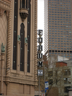
This image was taken from the top of Rialto tower.
I like the contrast between old and new, when looking at the buildings, that is illustrated in this image. The word 'forum' and the power cable that runs through this image adds a certain pizazz to the image.

This image was taken on one of the main streets of Hobart city. I like the rail in front and the lamps that continue right down the street. This image reminds me of a little country town although it is the main city of Tasmania.

Portfolio Idea Three

Another idea of mine for my portfolio was to play around with lighting. These are some of the image that I have taken. These images were taken in Eden (first two) and at Hobart airport (last image).


Presentation of photographer

Alvin Langdon Coburn

Born in Boston on the 11th of June 1882 Coburn received his first camera in 1890 when he was aged 8 and began his venture into photography expressing his artistic ability. Coburn was renowned for his cityscape's of New York, London and Venice and his portraits of famous American figures such as George Bernard Shaw, Henry James and William Butler Yeats.

Although his photographs were ‘distinguished by his exploring originality of approach,’ Coburn was the first to demonstrate abstract photographs in 1917 when he invented a kaleidoscope- like instrument with three mirrors clasped together which was able to fit over the lens of a camera and reflect and fracture the image. Coburn called this style of photography ‘Vortographs’, which was extremely important in the development of formalism and modernism in photography.

The reason for the change from his original pictorial movement to a more abstract cubism imaging was his involvement in a group who called themselves Vorticists. The group was made up of photographers including Wyndham Lewis, Henri Gaudier-Brzeska, Charles Nevinson and William Roberts. In a journal, Blast, written in 1914-15, Lewis attacked the sentimentality of 19th Century art and emphasized the value of violence, energy and the machine. “In the visual arts Vorticim was expressed in abstract compositions of bold lines, sharp angles and plans.” It was during this time that Coburn began experimenting with vortographs. Coburn created his images using a variety of printing techniques such as gravure, gum and platinum. Gravure printing is characteristically used for long run, high quality printing producing a sharp, fine image which involves engraving the image onto a copper cylinder. Gum Bichromate printing is created by permanently applying pigment to paper by using a photochemical reaction on most occasions several layers of colour pigment would have been applied to the one print. Platinum prints are photographic prints made by a monochrome printing process that provides the greatest tonal range of any printing method using chemical development. A majority of Coburn's works were published in Camera Works- the exquisite fine art photographic magazine which was edited and produced by Alfred Stieglitz from 1905-1917.

In 1907, George Bernard Shaw considered Coburn, who at the time was 24 years old, the greatest photographer in the world.

Quotes

- “Photography teaches its devotees how to look intelligently and appreciatively at the world…”


- “Why should not the camera artist break away from the worn out conventions… and claim the freedom of expression which any art must have to be alive.”

When looking at his images:

OLD

- Soft focus lens

- Romantic

- Misty

- Reminiscent


NEW


- Dynamic arrangement of forms

- Pound argues how Coburn’s Vortography leaps beyond

the‘stale and suburban’ style of pictorialism

- - Freed the camera from the representation of reality

- Brought photography on par with modern abstract painting


Information thanks to;
Also a special thank you to Google Images and Wikipedia

Self Image


At the end of week three's lesson we were asked to take a self portrait without making references to physical characteristics. This assignment proved difficult as no one really knows how to describe ones self. The reason for my hardship in completing this assignment was because I was looking for that one thing that represents me entirely in all aspects of my life; work, school, home. It didn't occur to me until much later that I act and behave differently in accordance to my surroundings (ie. the way I act in front of my family is different to the way I act in front of my friends and is the same for when I'm at work). The image I chose represents the different aspects and quirks about myself but like a puzzle comes together to form a single "image" or self.

Portfolio Idea One

Portfolio! What can I say? So much I'd like to do and show but so hard to come up with an idea. Here are a few photographs that I have been playing around with, still no idea of how to present it, but I am very partial to these images and even though I might not present this at least it up for people to look at.

This image was taken at the Pixar convention. I like the size difference between the cars and the light globe; people automatically recognise this as the lamp that introduces the beginning of the movie. (Thank you Pixar)
I am not 100% sure where I took these images, all I know is that I took them on the same day. In the image above I like the reflection of the pool and the lines and contours of the windows.